Design to live faster with Framer
Equal column height in a website design context simply shares the same height across all available columns of a container box.
There are a lot of plugins you can find to make equal height on the Elementor column.
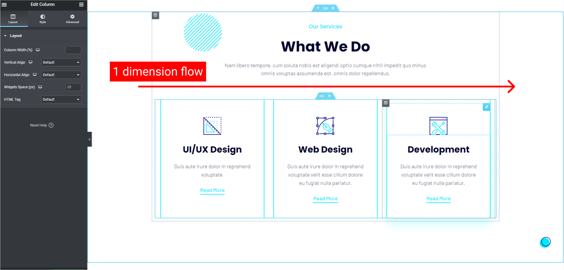
It is easy to make equal height column in 1 dimensional like 1 line of columns.
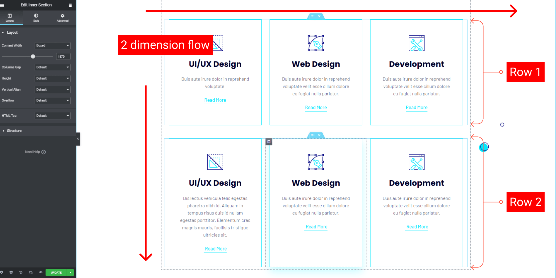
But how to make equal height for more than 1 row of column?
Here is my preferable way to make equal height on the column without plugin. No matter what widget you are using inside each column.
Please note during creating this tutorial I am using the version below :
- Wordpress v5.9.3
- LocalWP v6.3.1
- Elementor v3.6.4 and the Pro v3.6.5
- Hello Theme v2.5.0
I think it is necessary to inform you that I am using LocalWP for this tutorial. If you are new to LocalWP you can see my previous writing about LocalWP.
Step 1 - All Columns in A Inner Section
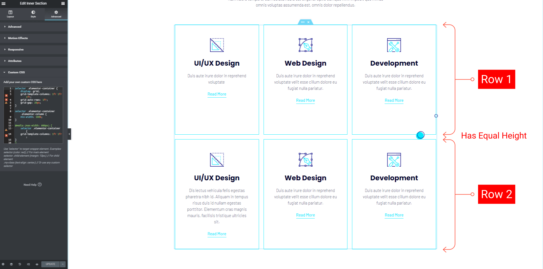
Take a look at the 2 dimensions (2 rows) from my attachment above. The first step is to make all the columns in one inner section.
So, there are 6 columns in one inner section.
Don't miss it: Best Lifetime Deals for Designers and Developers I'll Regret to Missed
Step 2 - Custom CSS
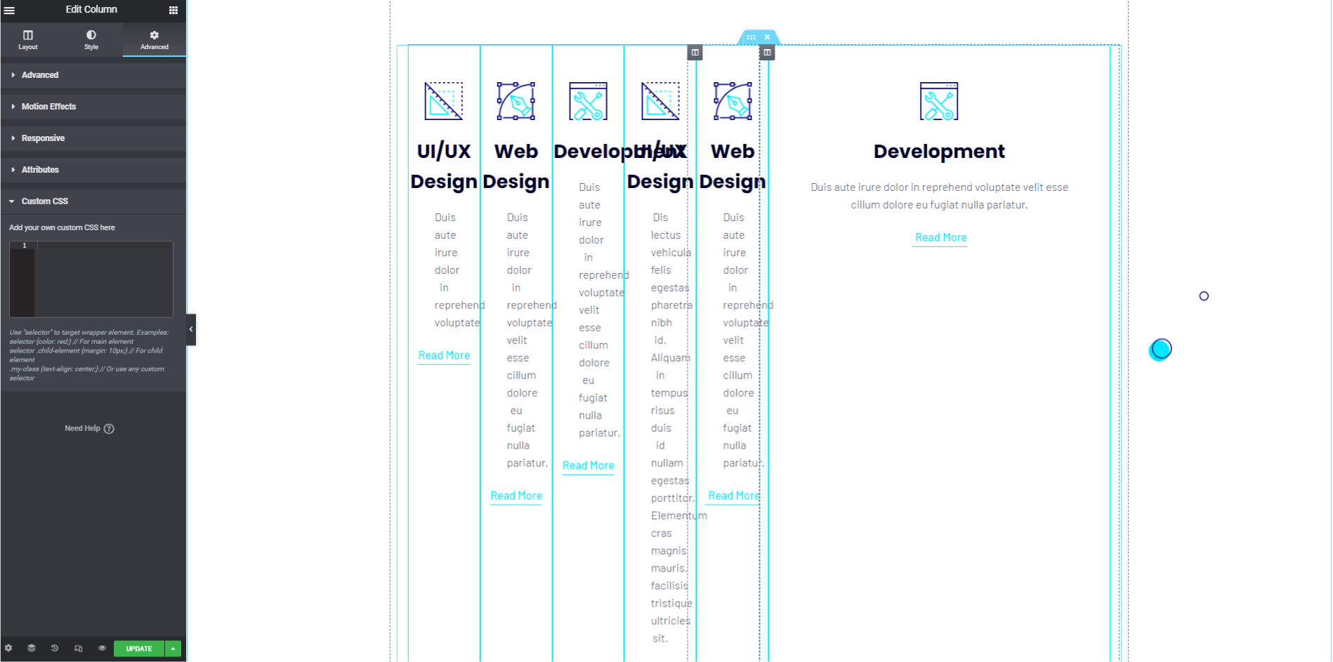
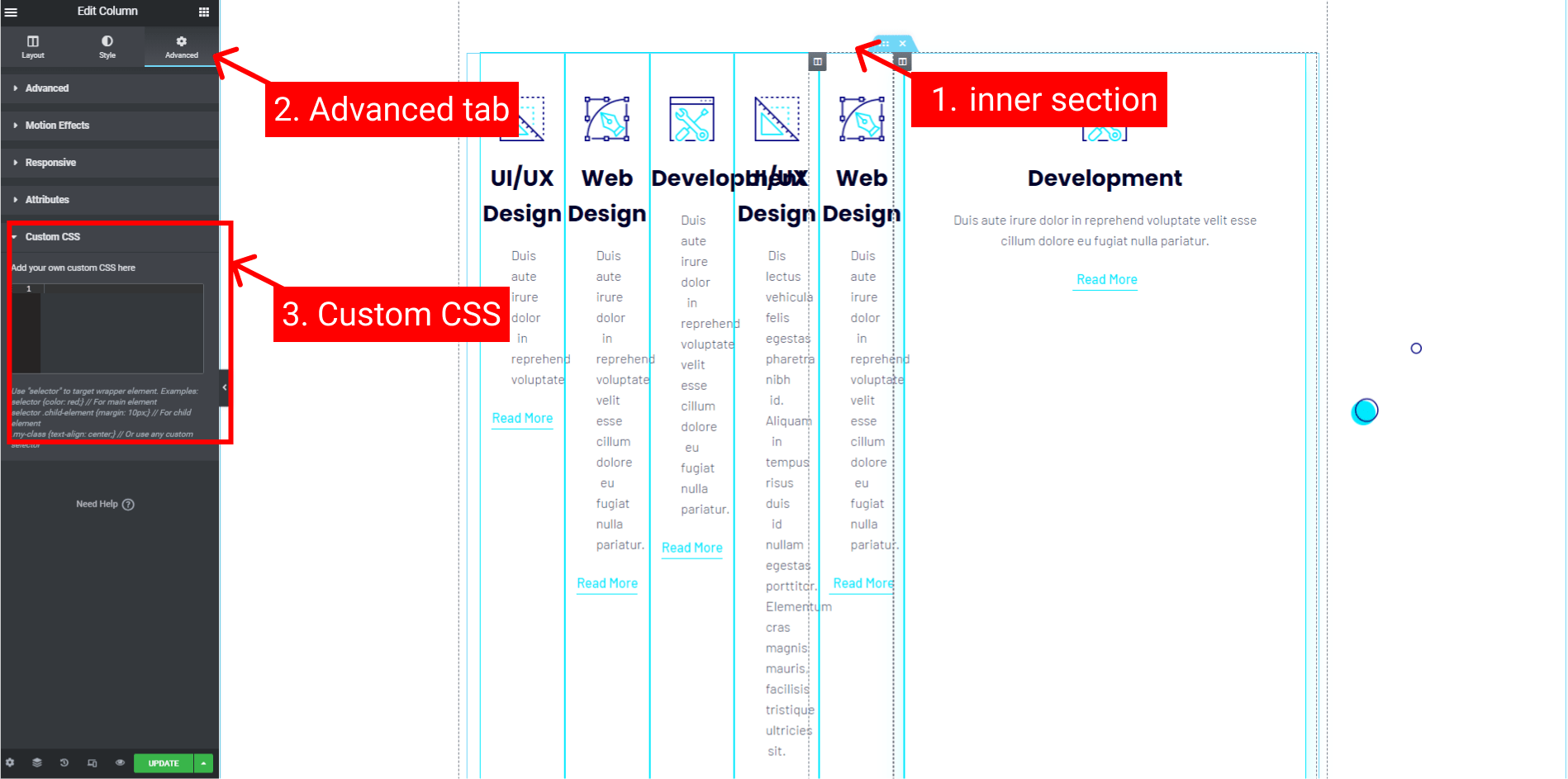
We will use the grid CSS property for the inner section to control the Elementor column. Select the inner section, then the Advance tab, then Custom CSS on the bottom.
You can use the code below.
selector .elementor-container {
    display: grid;
    grid-template-columns: 1fr 1fr 1fr;
    grid-auto-rows: 1fr;
    grid-gap: 20px;
}

selector .elementor-container .elementor-column {
    min-width: 100%;
}- As you can see, we need to add
grid-auto-row: 1fr;as a key property that consistently gives height values across all the columns. - Elementor by default auto-generated all column widths. Here we need to add
min-width: 100%;for the.elementor-columnclass.
All columns now should be showing like this.
Step 3 - Make it Responsive
For the last step, we have to control responsiveness.
In this Elementor version, we can activate the responsive mode and we can drag the width based on its device mode.
Let's say we want to change the column number to become 2 columns in its row for the screen below 600px.
In the mobile mode, change the width to 600px.
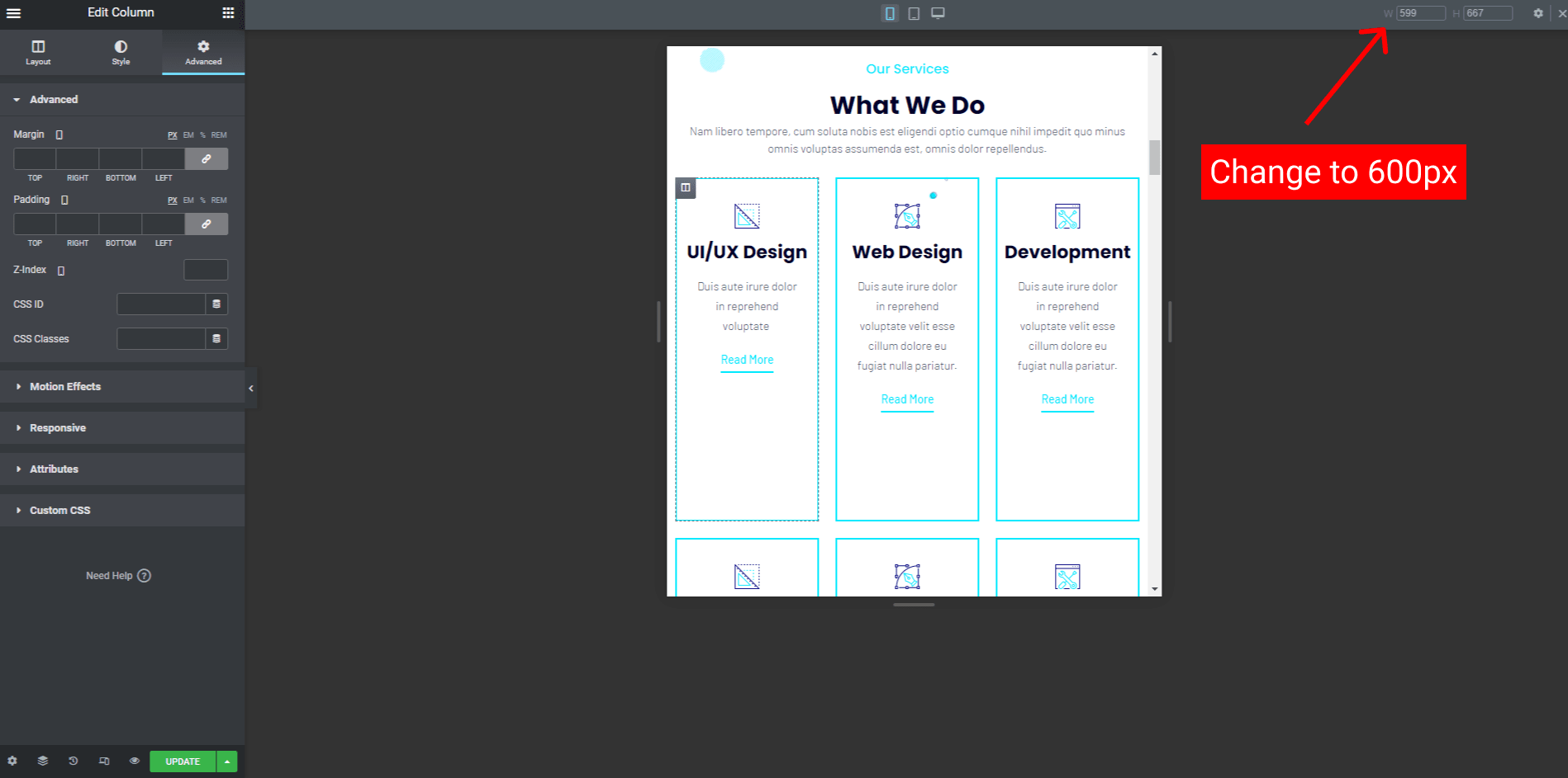
Still, on the Custom CSS of the inner section widget, add this CSS syntax below the previous code.
...

@media (max-width: 600px) {
    selector .elementor-container {
    	grid-template-columns: 1fr 1fr;
	}
}- In this code, I only remove 1fr from the selector. You can add more or remove on every screen width you want to adjust.
If you drag the width to below 600px, now you should see the change of the columns stack.
Conclusion
If you don't want to use the Elementor add-on only to create an equal height column. You can use this method to decrease the number of installed plugins.
Fewer plugins will make the site's performance better.
You can support this blog with cup of a coffee :
 Buy Me A Coffee
Check this lifetime deal to speedup your frontend development.