Design to live faster with Framer
This tutorial can be used for any website builder.
Go to the Lottie discover page or create by yourself. Here I picked from the Lottie discover page. I will use this to create a preloader screen.
If you open the animation page, you will see that there are so many options you can use to incorporate the animation.
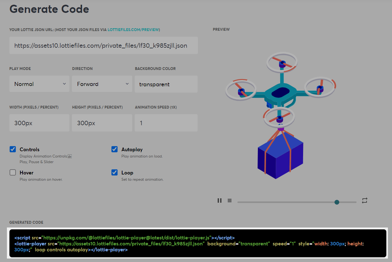
Now let's prepare the HTML part and use the code from Lottie, here is the code:
<script src="https://unpkg.com/@lottiefiles/lottie-player@latest/dist/lottie-player.js"></script>
<div id="preloader" class="preloader-container">
	<div class="animation">
		<div class="player">
			<lottie-player src="https://assets10.lottiefiles.com/private_files/lf30_k985zjll.json"  background="transparent"  speed="1"  style="width: 300px; height: 300px;"  loop controls autoplay></lottie-player>
		</div>
		<a id="skip">Skip</a>
	</div>
</div>
Then this is the style code:
.preloader-container {
	left: 0;
	top: 0;
	width: 100%;
	height: 100%;
	overflow-x: auto;
	overflow-y: scroll;
	position: fixed;
	z-index: 9000;
	display: -webkit-box;
	display: -ms-flexbox;
	display: flex;
	background-color: #f1f1f2;
	-webkit-box-pack: center;
	-ms-flex-pack: center;
	justify-content: center;
	-webkit-box-align: center;
	-ms-flex-align: center;
	align-items: center;
	overflow: hidden;
	-webkit-transition: all 1s linear;
	-o-transition: all 1s linear;
	transition: all 1s linear;
}

.preloader-container .animation {
	display: -webkit-box;
	display: -ms-flexbox;
	display: flex;
	-webkit-box-pack: center;
	-ms-flex-pack: center;
	justify-content: center;
	-webkit-box-align: center;
	-ms-flex-align: center;
	align-items: center;
	-webkit-box-orient: vertical;
	-webkit-box-direction: normal;
	-ms-flex-direction: column;
	flex-direction: column;
}

.preloader-container .animation #skip {
	color: #20495a;
	cursor: pointer;
	font-family: montserrat, sans-serif;
	font-size: 1.75em;
	position: absolute;
	margin: 0 auto;
	bottom: 20vh;
}

.hidden {
	display: none;
}

.visuallyhidden {
	opacity: 0;
}
last we adjust the delay and timeout. We can also add a skip button if the animation takes too long.
let box = document.querySelector("#preloader"),
	btn = document.querySelector("#skip");

function fadeOut() {
	box.classList.add("visuallyhidden");
	box.addEventListener(
		"transitionend",
		function (e) {
			box.classList.add("hidden");
		},
		{
			capture: false,
			once: true,
			passive: false
		}
	);
}

btn.addEventListener("click", fadeOut, false);
setTimeout(fadeOut, 3000);
See the final look: