Sponsor: Get .com for just $5.98
Frosted glass (also known as Glassmorphism) is a cool effect in user interface design trends.
It's great for settings where you want to provide some effect of seen through frosted glass.
This effect is surprisingly easy to implement by using CSS for components on your website.
Many of tutorials out there only just the backdrop-filter. I know that this backdrop filter syntax is still not compatible with some major browsers. You can also find the generator for this.
Anyway, here is frosted effect looks like
The container CSS code:
.container {
	width: 30rem;
	height: 20rem;
	display: flex;
	justify-content: center;
	align-items: center;

	border-radius: 8px;
	background-color: rgba(255, 255, 255, 0.31);
	backdrop-filter: blur(5px) saturate(100%);
}
For the .container class is generally, just like other glassmorphism code. Add background-color with some opacity(here I use white color as the background). Then of course add the backdrop-filter: blur(5px) saturate(100%); for the transparent glass effect.
Then.
.container:before {
	content: "";
	position: absolute;
	top: 0;
	left: 0;
	right: 0;
	bottom: 0;
	border-radius: 8px;
	padding: 1px;
	pointer-events: none;
	background: linear-gradient(
		135deg,
		rgba(255, 255, 255, 1),
		rgba(255, 255, 255, 0.25)
	);
	-webkit-mask: linear-gradient(#fff 0 0) content-box, linear-gradient(#fff 0 0);
	-webkit-mask-composite: destination-out;
	mask-composite: exclude;
}- Here in the container pseudo
:beforeclass, I add some gradient from solid white to transparent. - This pseudo-element is for the custom border gradient. I found that making a border gradient and border-radius is tricky to implement. We need to utilize the
mask-compositeto make it works. - Then don't forget to make it cover the container box using the CSS
absoluteproperty.
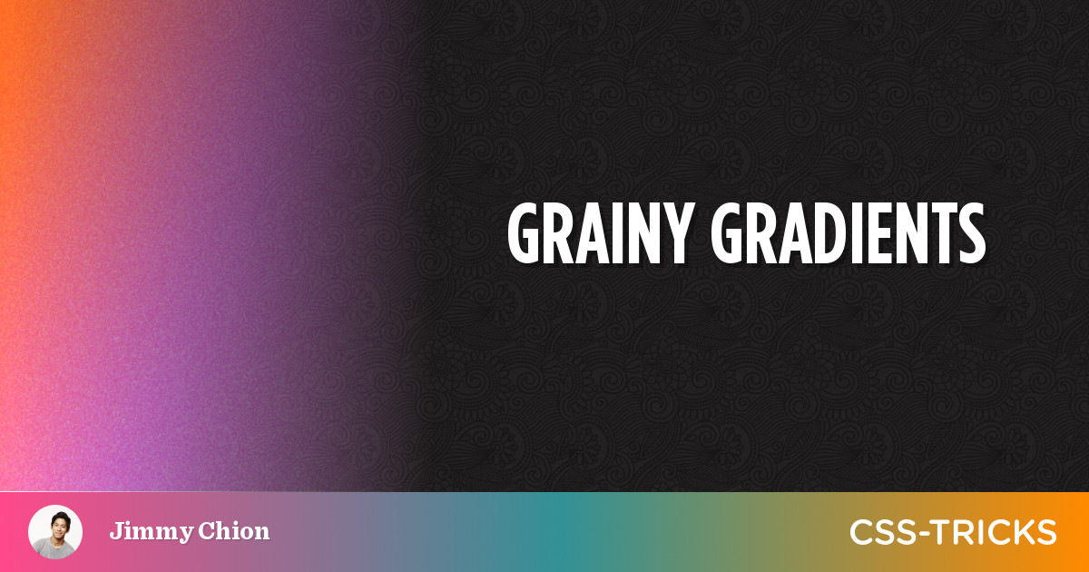
The frosted effect was created by using the grainy generator. Previously Jimmy Chion wrote an article on CSS-trick explaining about how he create grainy gradients using SVG. He also creates the generator for generating SVG grainy gradient.
There are two layers of background syntax created by the generator. First is for the gradient color, and the second is for the SVG.
.frosted {
	position: absolute;
	top: 0;
	bottom: 0;
	right: 0;
	left: 0;
	opacity: 0.5;
	pointer-events: none;
	border-radius: 8px;
	z-index: -1;
	background: linear-gradient(
			135deg,
			rgba(255, 255, 255, 0.75),
			rgba(0, 0, 0, 0.5)
		),
		url("data:image/svg+xml,%3Csvg viewBox='0 0 250 250' xmlns='http://www.w3.org/2000/svg'%3E%3Cfilter id='noiseFilter'%3E%3CfeTurbulence type='fractalNoise' baseFrequency='0.45' numOctaves='3' stitchTiles='stitch'/%3E%3C/filter%3E%3Crect width='100%25' height='100%25' filter='url(%23noiseFilter)'/%3E%3C/svg%3E");
}- We still use
absoluteproperty to make it cover the container box. - For this element, I put it in the back of the container by adding
z-index: -1. - Add another
linear-gradient, here you can play with the colors, opacity, and direction. - The last is the grainy effect. I put the generated code from the grainy generator here.
I am pretty satisfied with the result, it looks more realistic instead using backdrop blur. The limitation of this approach is the browser compatibility. I use so many CSS syntaxes that are currently not supported by major current major browsers. Like backdrop-filter and the mask-composite. But I hope you can take learn from this approach.
References:
 Jimmy Chion